
Dexign Matter branding

The identity of the Dexign Matter is based on a radical approach to graphic design. It aims to communicate creative and smart design thru simple basic forms.
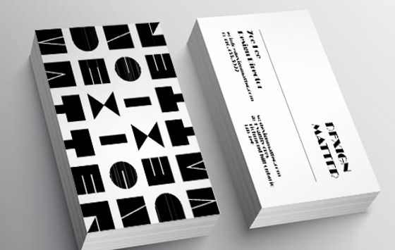
The harmonic visual image, inspired by solid blocking, consists of simple shaped compositions made unique via an experimental use of typographic elements. These components are manifested on design labels, through a geometric motif on the business card, and through a lively decoration on the stationery.

The goal of the logo was classic design, geometry, bold, basic shapes and minimal form. A clean and well-structured identity executed and appropriated across many different items from the business card to the supporting printed material. The balance between black and white, abstract form and type is superb, modern and fresh.
“We resolve all the matters for design” I wanted to respect this quote, so I decided to create an extremely minimal design. The only thing that matters is the name of the company Dexign Matter
